

The SkyFi platform gives users access to satellite data through a browser-based interface. One key feature allows you to view analytics highlights based on selected regions and timeframes. It shows patterns related to data usage, tasking demand, and user activity across different locations.
In this tutorial, you will learn how to view analytics highlights using a clear, step-by-step process. First, it walks through the available tools in the interface. Then, it explains the types of data shown and how to read each chart or summary. You can compare changes across time and location using built-in filters and visualizations.
You do not need a technical background to use this feature. The guide focuses on basic steps that help you access and understand the information provided. Whether you use SkyFi for research, business, or monitoring activity in a specific area, this feature gives you a simple way to review data patterns.
To support you further, the tutorial includes screenshots and short notes for each step. By the end, you will know how to find the analytics page, adjust filters, and read the output shown. This will help you make better use of the data available on the platform.
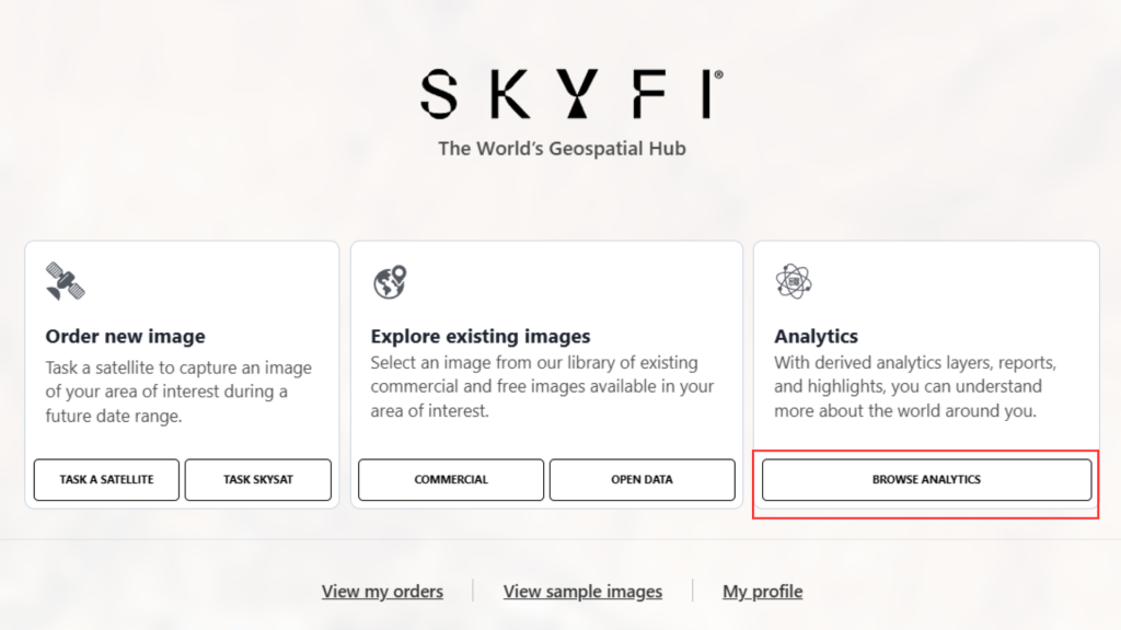
1. Start from the Welcome Page
- From the welcome page, click on “Browse Analytics.”
2. Access Sample Highlights
- Select an analytic from the library.
- Click “View Sample Highlights.”

3. Interact with the Preview
- A preview will load showing a sample of the analytic output.
- Use the slider bar to toggle between the original image and the analytic overlay.
- You can slide back and forth to compare the imagery with the analytics output.
- You can switch to split view to see both views side by side.

Now that you know how to view analytics highlights on the SkyFi platform, start using the feature to track trends and data activity. Log in to your account and try it today.